While some fear slide film for its high contrast, I have long feared color negative film for the mysterious ways it hides its true color. With my trusty Fuji Provia100F slide film loaded into my camera I was always ready to take on the world in vivid color. The stuff is almost scientific in perfectly reproducing the color laid before it. My limited attempts at color negative film either left me disappointed in the color or spending hours adjusting color curves in software. Once in a while I would hit a grand slam but it was something I had trouble reproducing. I wanted to ditch color negative film altogether but one thing made me want to keep trying: other artists’ amazing color work. Just one more roll of Kodak Portra or Fuji Pro and my work would start to look like the work of those I admired, I hoped. Perfect skin tone with controlled highlights and pastel meadows in the background. I think I have finally nailed the problem and I hope it will set me on a quest to create with color negative film. That and maybe the large amount of Portra I have lying around because I buy it then run and hide behind my Provia all to often.
For me it was a long learning process. I tried all the different scanning software. Nothing was working consistently for me. There is so much amazing work produced from color negatives that I knew the great color was hiding somewhere in those negatives of mine.
It turns out what makes turning a negative into a positive difficult is the fact that it records each color differently. In addition to that, the large latitude of negative film and the orange mask add more layers of complexity. The characteristic curves below illustrate my point. On the right is slide film. What you see is what you get. Each color lines up because the film responds to to all colors equally. When you get your developed slide back it looks just like what you took a picture of. With negative film you would think that if you simply inverted the negative in Photoshop you would end up with a beautiful positive but if you try that you will find out that is not the case. Even correcting for the orange mask does not solve the problem. The problem is that the film has different responses to red, green, and blue light. The characteristic curve on the left shows this. Not to dive into the details of the charts, for equal exposure of all colors, blue will have more density than green and both of those more than red.
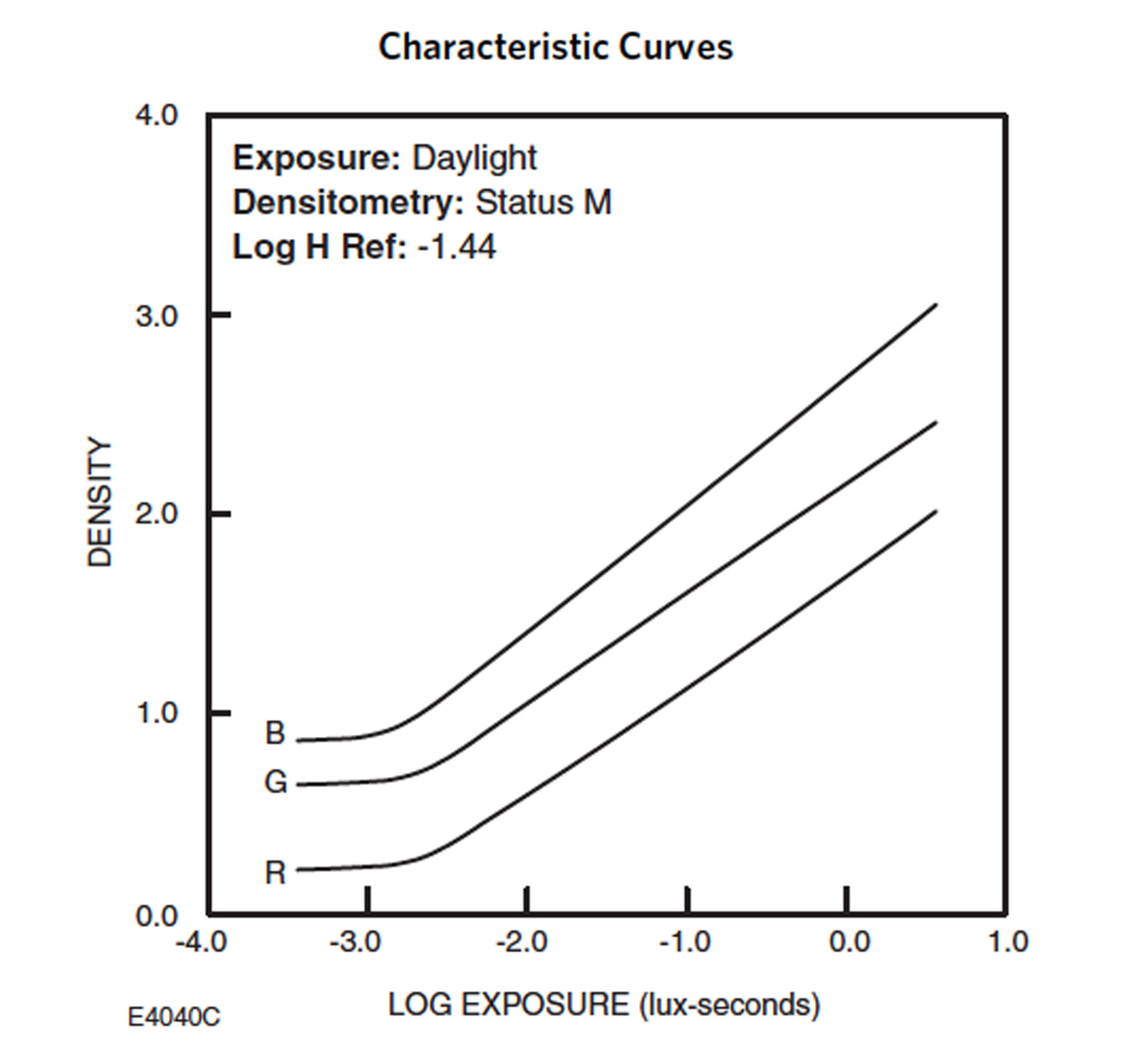
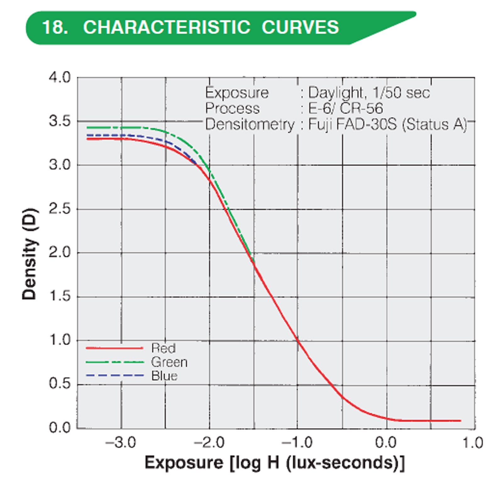
Characteristic curves (Left: Negative Film, Right; Transparency Film)
The solution that I found was inspired by a common practice in digital photography: the white balance card. Many scanning software packages claim to know what they are doing to correct for all of this and some do better than others but there is a fundamental flaw in the way that they work. This software does not know what you took a picture of. What the software is good at is dealing with the complex inversion process. I let the software do its best to invert the image and then I take control from there. The one caveat to this method is that it is most suited to someone with a controlled shooting style who shoots a series with the same lighting and camera settings. Each change in lighting and camera settings requires another shot of the white balance card.
The specific steps are as follows:
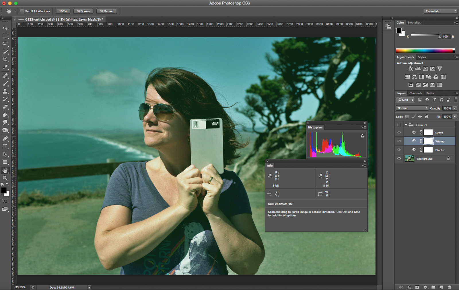
1. Under each setup with the same lighting and exposure take a photo including a white balance card. This card must have black, white, and grey points. I like the Whibal G7 card.
2. When you are scanning, the scanner must be set to manual so every image is scanned in the same manner. It’s ok if the color is not great at this point.
3. Leave a bit of room at the dark and light ends of the image. Your image histogram will not fill the entire range but this is necessary to get readings off of the black and white parts of the card later.
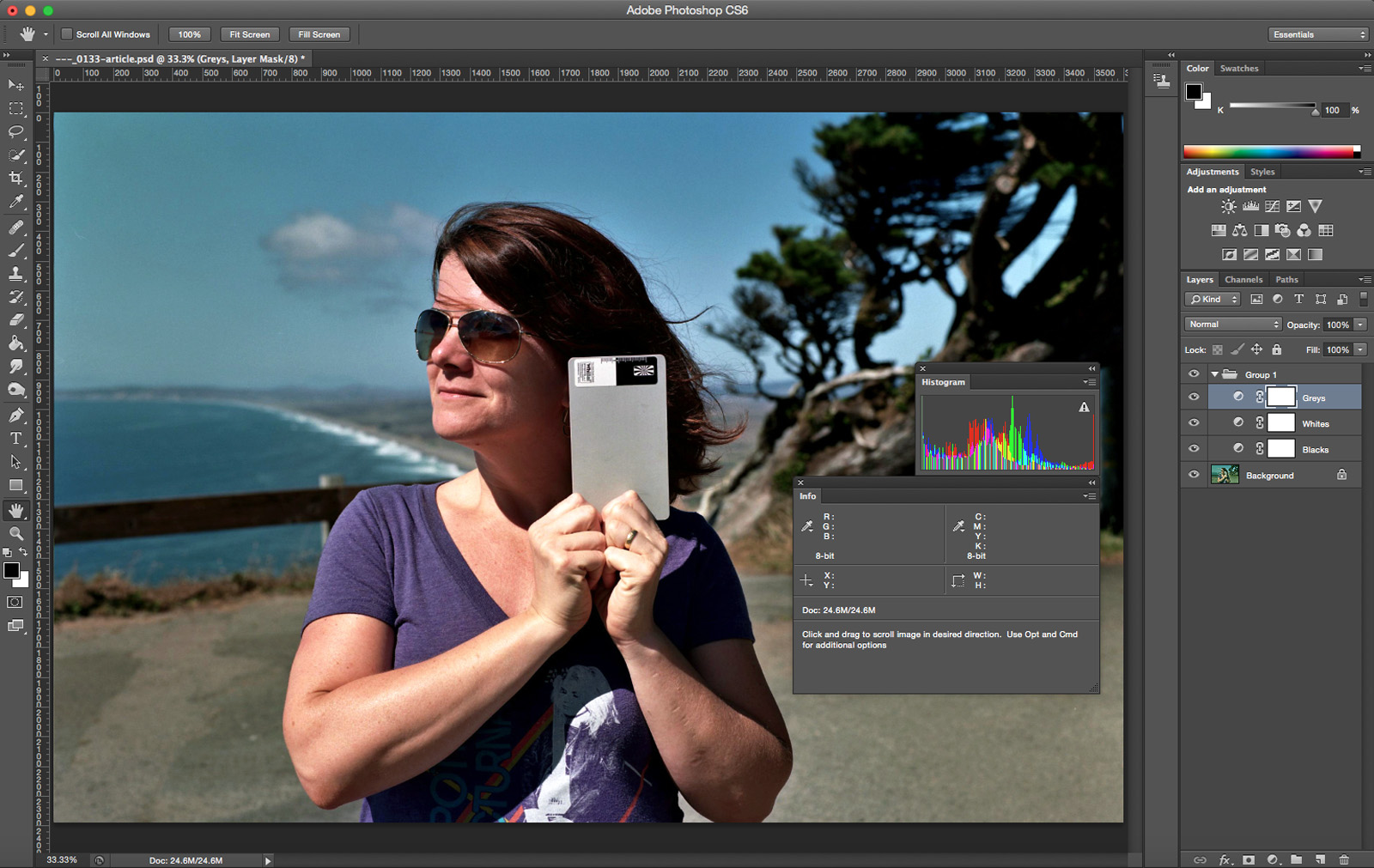
4. Bring the image of the card into Photoshop.
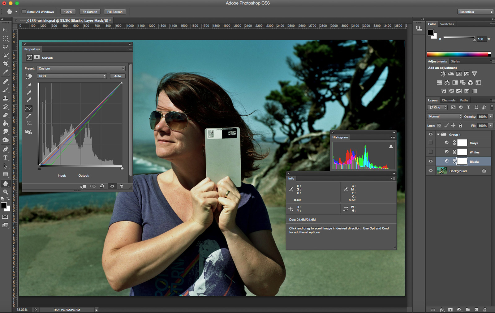
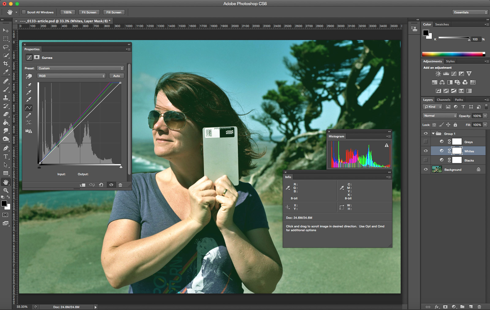
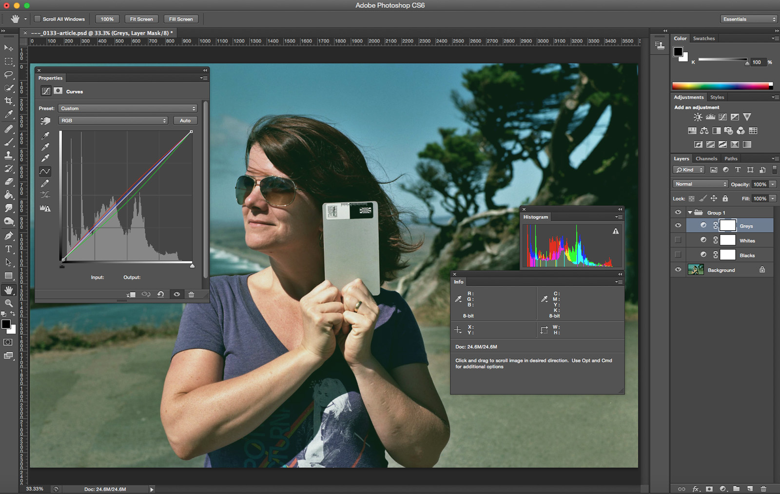
5. Use curves to correct the color based on the card automatically. In curves there are little white, grey, and black eyedroppers. Select each one of these and click on the matching part off the white balance card.
6. Make any adjustments to the color and contrast based on your personal preference.
7. Copy those curves into the rest of your images and watch the color magically improve.
8. As a note, some scanning software has the ability to set these white, grey, and black points. If this is the case you may not need to use Photoshop.